When making a quilt it's always fun to play around with colour and fabric options, whether we're pulling fabrics from our stash, buying online or from our local quilt store.
Creating my Trapped Square quilt pattern (available Monday, 21 November 2016) has given me the perfect opportunity to share some of these options with you along with design ideas you can try for yourself when considering your next quilt project.
Disclosure/Disclaimer:
COLOUR PLACEMENT
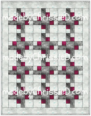
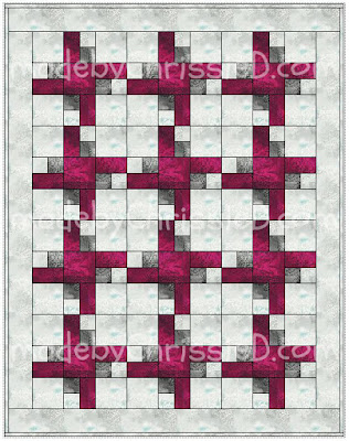
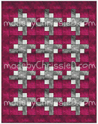
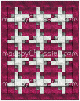
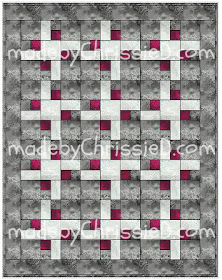
Using only three fabric colours from Benartex's Dreamscape fabric collection, let's consider how different a quilt can look depending on the placement of each colour - this technique will work equally well for any quilt.
Using the Trapped Square quilt pattern depending on placement,three fabric colours will allow us six quilt options, I'm using EQ7 (Electric Quilt 7) software to show each.
Uncredited reproduction of all content, text and images on this site is prohibited.
All content, text and images must be credited to Chris Dodsley @made by ChrissieD and include a link back to this site.
Linky Parties This post may be linked to some great Linky Parties, always a great source of inspiration too. If you click through to my 'Fave Linky Parties' page you can see where I like to share my work.
Creating my Trapped Square quilt pattern (available Monday, 21 November 2016) has given me the perfect opportunity to share some of these options with you along with design ideas you can try for yourself when considering your next quilt project.
This post is for informational purposes only,
no payment or commission is received on click-throughs to links shared.
no payment or commission is received on click-throughs to links shared.
COLOUR PLACEMENT
Using only three fabric colours from Benartex's Dreamscape fabric collection, let's consider how different a quilt can look depending on the placement of each colour - this technique will work equally well for any quilt.
Using the Trapped Square quilt pattern depending on placement,three fabric colours will allow us six quilt options, I'm using EQ7 (Electric Quilt 7) software to show each.
This is such an interesting exercise to try because, as you can see, the quilt takes on a different feel in each instance even though you're working with the same three fabrics. Next time you're making a quilt consider trialling the fabrics in different placements. You may be surprised to discover your initial placement choices aren't what you go with for your final design.
If you don't have EQ7 or another software programme to do the work for you, try drawing a simple pencil sketch - if you have access to a printer or photocopier make several b+w copies then colourise them using coloured pencils/pens or watercolours. Don't think you can draw? No-one else needs to see your sketches so have a go, you may find the hidden artist inside.
COLOUR PROPORTION
When looking at colour it's important we consider it in the correct proportions. A loud lime green might be quite offensive if you use it for a whole cloth quilt back but could bring a quilt top to life with a pop of colour when used as a binding, flange or narrow border.
Experiment with fabric proportions by laying the fabrics out for consideration in order or better still in a rough layout of your chosen design. Most importantly use the approximate proportion/percentages you'll be using them. Remember to include your binding fabric in these choices.
I've put together five photos of the three fabrics used earlier, each showing varying proportions so you can see how the overall impression changes with each proportion option.
You'll notice the red is always the most dominant colour - even in the final photo where it's in the smallest proportion.
Red is always strongly visible in any form and even in the smallest amounts - that's why it's used to denote danger, for fire engines, stop signs, etc. Beware when taking holiday photos - try not to capture anyone walking through your photo wearing red - they'll become the highlight of your pic!
Red is often used in artworks to draw the viewers attention - just a small dot will pull focus to that area of a piece and you can use this to your advantage in your quilts too.
INTRODUCING A FOURTH COLOUR
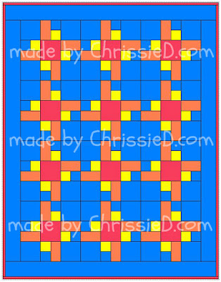
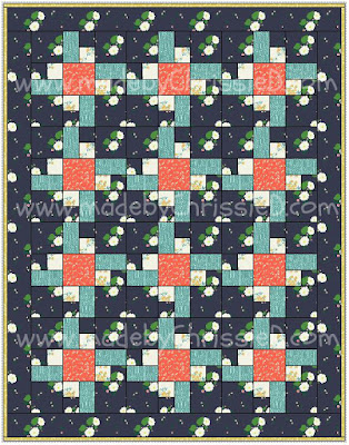
Continuing to play with the Trapped Square quilt, I've put together two more colourways to show how the design can look crisp and clean against a white background or really pop as a bright kid's quilt - for each of these I've finished the quilt with a binding that matches the centre square of the block. If your palette feels restricted with only three colours you can introduce a fourth as I have in the kid's quilt on the right.
PLAYING WITH PRINTS
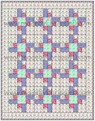
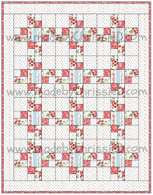
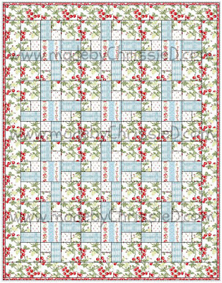
EQ7 allows you to import fabric samples to 'colour' your quilt designs. For fun, and to show just how different this quilt can look depending not only on colour but also on print choices, I've sampled the quilt with some fabrics I've recently worked with for Windham Fabrics and Benartex Fabrics.
The first 3 quilts have a vintage, country, shabby-chic feel - again I've used four fabrics rather than three to create the blocks.
Left: Ruby Red Designs' First Blush collection for Windham Fabrics
Centre + Right: Anna Stuart's Simply Chic collection for Benartex
I love the modern feel of the next two examples - again four fabrics for the blocks and for Lotta's Hemma collection I've used a soft white solid for the block background and changed the border fabric to match the centre block squares. I'm totally loving this quilt and have a bundle of Hemma fat quarters that Windham sent for me to play with so I thnk I'll be making this one up for real before too long.
Left: Lotta Jansdotter's Hemma collection for Windham Fabrics;
Right: Annabel Wrigley's Maribel collection for Windham Fabrics
And finally, taking things back to where they started with my tute for the Trapped Square Quilt Block for the NYC Metro MOD Quilt Guild...
...here is a sample of what the original block will look like made up as a quilt.
I hope you've enjoyed looking at the Trapped Square quilt samples and maybe you'll find one or two of my tips useful when planning your next quilt design.
Don't forget to visit my blog again on 21 November 2016 when I'll be releasing the Trapped Square quilt pattern.
QUILT DESIGN - PLAYING WITH COLOUR AND FABRIC OPTIONS
Clicking on an image will take you to a new page of crafty goodness :)
Disclosure/Disclaimer:
This post is for informational purposes only, no payment or commission is received on click-throughs to links shared.
Copyright:
Linky Parties This post may be linked to some great Linky Parties, always a great source of inspiration too. If you click through to my 'Fave Linky Parties' page you can see where I like to share my work.








oving this block can see me making these maybe will do some with scraps too
ReplyDeleteOh, you are the most inspiring quilter/artist!! I enjoy learning so much from you. Your color study with this block opened my eyes to many possibilities....I cannot wait to try it!!
ReplyDeleteWhat a fascinating read Chrissie, as someone who rarely quilts I had never thought about the impact of choosing which fabric goes where. The software looks very helpful.
ReplyDeleteBrilliant tutorial as always, love the one where the cerise is on a lighter background, makes the colour pop
ReplyDeleteThat's amazing, how completely different the same pattern can look. I'm trying to pick a favourite, you've not made it easy but I think it'll have to be the top left in the Playing with prints section. So pretty.
ReplyDeleteThis post was so interesting! I am going to follow your lead and play with color and placement more now!
ReplyDelete