Today I'm sharing my Colour Drop Quilt - the whole process from design brief through to the photo shoot in Miami. With tips and a block tute too, there's plenty to spark ideas and inspire.
Disclosure/Disclaimer:
Chris Dodsley of mbCD is a friend of Melanie Testa, co-author of Playful Fabric Printing. Melly provided mbCD with a selection of hand printed fabrics to make a sample quilt top for Fall Quilt Market 2016, all other materials used to make the quilt are from mbCD's personal stash. In all other respects, this post is for informational purposes only, all opinions are mbCD's own and no payment or commission is received on click-throughs to links shared.
Melly's Hand Printed Fabrics
Back in October, my friend, artist Melanie Testa, asked me to make a quilt using some of her sample hand printed fabrics.

Melly's Design Brief
Back in October, my friend, artist Melanie Testa, asked me to make a quilt using some of her sample hand printed fabrics.

Melly's Design Brief
⊿ simple blocks, half square triangles, 9-patch, etc
⊿ combine hand prints with solids, semisolids and/or low volume prints - I want to see how these hand prints interact and play with commercial fabrics
⊿ my hand prints need to remain the focal point of all fabrics used
⊿ keep the designs large when cut to showcase the prints
⊿ if possible, also showcase the half drop pattern repeat
My Quilt Block Design + Colour Selection
⊿ the hand prints measure 9-1/2" x 8-1/2" and are a half drop design and I want to keep wastage to a minimum - best way to do this is to slice sample rectangles in half diagonally
⊿ pair the hand prints with similar colourway solids from my stash to make Half Rectangle Triangles, allowing me to rematch the pattern at the opposite ends of each print which will showcase the drop and pattern repeat perfectly - thus creating parallelogram blocks
⊿ the samples aren't absolutely matched in size but if I don't trim them then I won't lose repeats. Some of my points won't match exactly and I'll have to fudge some seams down to 1/16" (or less!!!) but by doing this I can make it work and not have to cut into the pattern - none of this will show on the front of the quilt top and, most importantly, there's no wastage at all
⊿ search solid stash for colours as close as possible to the curved design on each block to pull forward and strengthen this design element - if possible don't repeat colours
Having chosen the block design and fabrics, I set about making my HRTs
No Fuss Half Rectangle Triangle (HRT) Block [Technique]
Click through to find out more about the technique I used to create the HRTs/Parallelogram blocks.
With the blocks made, I took one block from each colour way and played around with colour and tone values. I'm including images below of how my 'play' progressed to a final outcome.
There are three ways of looking at placement:
⊿ tonal groups/gradation (light to dark)
⊿ colour groups/gradation (light to dark)
⊿ colour+tonal groups/random
- I'm linking colour and tone together in the 'random' placement because if I decide to go with random colour then I always like the tonal placement to be random also - colour placement that appears random but is tonally balanced is more visually pleasing.
I use two methods to look at tonal values:
⊿ a red plastic sheet that I look through
⊿ turn my images to black + white
interestingly the result isn't always the same as you'll see in the second sample where I have used both methods.
I take photos of each layout as I go so I can look back at the photos and make design choices based on colour and tonal values.
Tonal Groups/Gradation (light to dark)
In the above sample, the pink surprised me - (C)olumn 2, (R)ow 3, so I moved it down to C1, R5, I also move the top pink and bottom grey in C2.
Below, it's interesting to see how the value of the pink that is now in C2, R3 changes across the three images and take note of the different values of the two magentas in C4, R2/R5 when viewing through red and also in B+W
Of course, there are no right or wrong answers here, these techniques are simply tools to help you balance out your colour placement. In the end, the final decision is up to you and what effect you want to create and what you find visually pleasing.
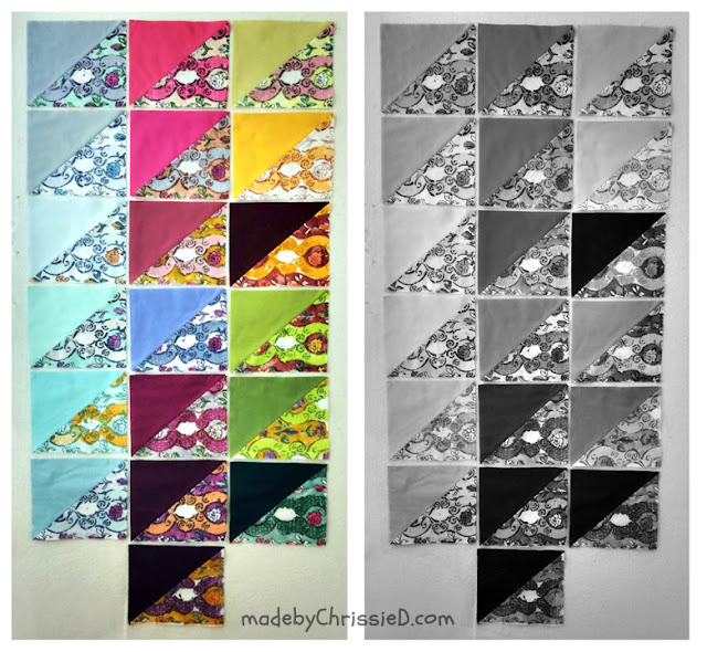
Deciding to go with the B+W method I balanced the colours out fairly evenly into 4 tonal values.
Colour Groups/Gradation (light to dark)
Moving away from tonal values now, this time I'm experimenting with dividing the colours into 3 colour groups
C1: Blues+Aquas
C2: Pinks+Purples
C3: Yellow+Greens
The results I'm seeing in tonal gradation and colour gradation aren't pleasing me so it's time to play with the third option, random colour/tonal placement.
Colour+Tonal Groups/Random
In finding a pleasing colour layout I also need to lose one block completely from the pack - I place the 'odd' block at the bottom in each image.
This really is a case of playing around with layouts until the colours please and the tones are balanced.
My chosen final layout is on the right in the colour and the B+W images above. The bottom block (C1, R5) is lighter than I'd like in the B+W tonal view but I feel it is strong enough to carry the corner well when looked at as a colour.
Blocks That Didn't Make The Cut
I have one pair of HRTs that I didn't include on the top. I still made these 2 blocks so I could play around with colour choices.
I chose this block colourway to leave out as the flower print against the background and the scrolls against the curves don't contrast as they do in all the other hand print blocks - indeed the colours are instead very similar so, although the details are all there for this block as with the others, it isn't as strong visually.
It's All About The Colour Drop Quilt

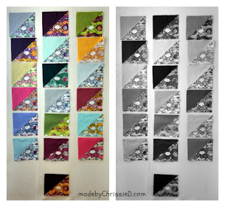
Just for fun, when the blocks were completed I took a photo of another design layout I considered. I didn't go ahead with this design as it doesn't show off the half pattern repeat as well as joining the HRTs into Parallelogram Blocks does.
Melly's Reaction
When the top was complete I sent Melly some pics. This was her reply:
"OMG, I LOVE IT!!! The photography is awesome, your work and the elegance of hand print use is perfect. THANK YOU for listening and providing great samples!!!"
"OMG, I LOVE IT!!! The photography is awesome, your work and the elegance of hand print use is perfect. THANK YOU for listening and providing great samples!!!"
Fall Quilt Market 2016
Melly wanted me to make a quilt top that she could take along to Fall Quilt Market. I can confirm her trip was very successful in many ways, none of which I'm allowed to share at the moment, though I can mention that her new book Playful Fabric Printing has now been published and I'm delighted to have taken part here in the book release Blog Hop.
Finishing The Quilt
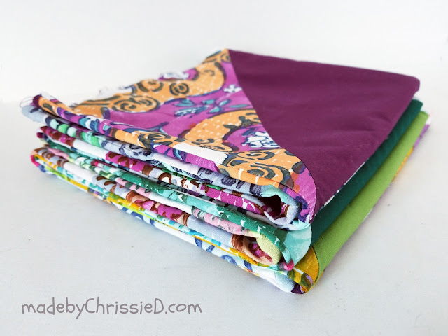
After Quilt Market, Melly returned the top to me and I made it up into a quilt.
I had this fabric in my stash and it spoke to me, actually it shouted and screamed at me in a way that was impossible to ignore. It was more than strong enough to hold its own against all the strong colours in the quilt top (and let's face it that was going to take some doing) but didn't detract from them in anyway or become the star of the show. A print just wouldn't have cut it and a solid would have been dull - the visual effect and colour play of the gingham are a perfect match for the boldness of the quilt top.
I've backed and bound with this yellow and blue small check gingham, which to our colour perception appears green and I've included two rectangles of solid green and blue also to give the eye somewhere to rest.
The quilt is machine quilted down the length of each quilt top solid section with 'organic' straight lines 1/2" apart and using a 4.0 mm length stitch. It is also machine quilted 1/8" on either side of the print/solid diagonals.
The top machine stitching is created using various colours of Aurifil 40/2 and 50/2 that match each solid top fabric while the bobbin thread is Aurifil #1231 - Spring Green, practically invisible against the gingham backing.

Finally, the quilt is hand quilted using Aurifil Aurifloss thread. I used the full 6 strands to quilt with. Each pair of blocks is quilted in a contrasting colour that is part of the hand print.

The hand stitching is straight across the length of the solid fabrics to the point where it joins the hand print fabric and then follows the curve of the design across each print until it continues straight across the solid at the other end of the parallelogram block.
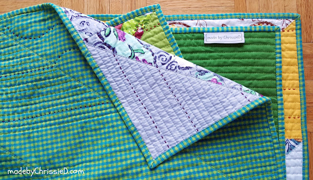
The finished size of the quilt is 55-1/2" x 48".
The result, probably one of my favourite quilts ever. There's so much visual impact and I've woven myself into the finish with the hand quilting, I was enjoying it so much I didn't want to stop but did for the sake of finishing and taking the photos. Who knows, I may add more stitching to it in the future.
The quilt is machine quilted down the length of each quilt top solid section with 'organic' straight lines 1/2" apart and using a 4.0 mm length stitch. It is also machine quilted 1/8" on either side of the print/solid diagonals.
The top machine stitching is created using various colours of Aurifil 40/2 and 50/2 that match each solid top fabric while the bobbin thread is Aurifil #1231 - Spring Green, practically invisible against the gingham backing.

Finally, the quilt is hand quilted using Aurifil Aurifloss thread. I used the full 6 strands to quilt with. Each pair of blocks is quilted in a contrasting colour that is part of the hand print.

The hand stitching is straight across the length of the solid fabrics to the point where it joins the hand print fabric and then follows the curve of the design across each print until it continues straight across the solid at the other end of the parallelogram block.

The result, probably one of my favourite quilts ever. There's so much visual impact and I've woven myself into the finish with the hand quilting, I was enjoying it so much I didn't want to stop but did for the sake of finishing and taking the photos. Who knows, I may add more stitching to it in the future.
The Photo Shoot
I took the finished quilt down to Miami, South Beach with me last week as I thought the light would be fabulous for the photo shoot and allow the colours to sing far more than they would in the grey north right now.
I wasn't disappointed!
Clicking on an image will take you to a new page of crafty goodness :)
Disclosure/Disclaimer:
Chris Dodsley of mbCD is a friend of Melanie Testa, co-author of Playful Fabric Printing. Melly provided mbCD with a selection of hand printed fabrics to make a sample quilt top for Fall Quilt Market 2016, all other materials used to make the quilt are from mbCD's personal stash. In all other respects, this post is for informational purposes only, all opinions are mbCD's own and no payment or commission is received on click-throughs to links shared.
It's All About The Colour Drop Quilt

It's All About The Colour Drop Quilt

Copyright:

Linky Parties This post may be linked to some great Linky Parties, always a great source of inspiration too. If you click through to my 'Fave Linky Parties' page you can see where I like to share my work.









Very interesting process and gorgeous result.
ReplyDeleteWow...so interesting! The finished quilt is gorgeous! The very special fabric shines but your design and the quilting elevates this to another level! The hand quilting is brilliant!
ReplyDeleteThanks for sharing the process you used to make that beautiful quilt! I especially liked your use of machine and hand quilting! Beautiful!
ReplyDeleteWhat a fantastic process...start to finish! And what a treat to use original Melly Magic Material!
ReplyDeleteWow, that was fun! I love the quilt and learning about all your thoughts and Mel's reaction and input. That's the best part of quilting, working, sewing, talking and laughing with your friends. Nice work, I'm inspired!!
ReplyDeleteDenise~
Thanks for the detailed description, I really liked the way you choose the colours of the quilt. And the result is fantastic!
ReplyDeleteCheers,
Emese
Absolutely beautiful!
ReplyDeleteThat's just so beautiful, and they way you've hand finished it is just lovely.
ReplyDeleteI'm really interested to read about your colour balancing techniques, it's fascinating how colours work together.
Thanks for shairng at #HandmadeMonday
Love the quilt and quilting, and also the way you displayed it on the wooden closet, which might very well be your fabric closet, as is mine.
ReplyDeleteVery cool. Thanks for sharing your process, Chris.
ReplyDeleteI love the fabrics, it's a wonderful quilt. And a great photo shoot too. The beach photos are my favorite. Thank you for sharing at The Really Crafty Link Party this week. Pinned!
ReplyDeleteI love the story of the whole process and the quilt is awesome!!!!
ReplyDeleteOh what a fascinating process, and I love the different layout options you tried out as well as the finished quilt :)
ReplyDeleteThanks for sharing your process!!
ReplyDelete